Rebranding is an essential marketing strategy businesses often undertake to revitalize their image, stay relevant or expand their customer base. When executed successfully, rebrands can breathe new life into a company and strengthen its position in the market.
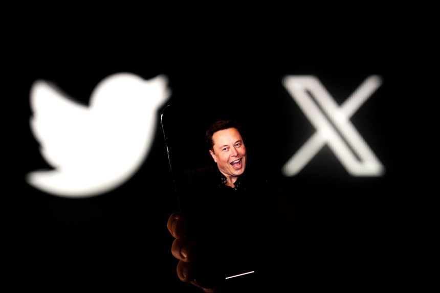
On Sunday, July 23, Elon Musk tweeted (soon to be referred to as xd?) that he intends to replace Twitter’s ten-year-old blue bird logo with a brand-new one that features an “X.” It’s the business tycoon’s most recent attempt to phase out Twitter’s branding, which hundreds of millions of users worldwide have grown accustomed to over the past ten years.
Related: Twitter Is Now Officially ‘X’: ‘There’s Absolutely No Limit to This Transformation’
Since purchasing Twitter for $44 billion in October 2022, Musk has made a series of changes in hopes of revitalizing the social media platform, including:
- Rebuilding Twitter’s verification system by requiring new applicants to purchase a Twitter Blue subscription.
- Laying off half of Twitter’s workforce.
- Issuing an ultimatum to employees to commit to “extremely hardcore” work or leave.
2023 has been nothing short of tumultuous for Twitter.
As of mid-January, only 180,000 users in the U.S. were paying subscribers (less than 0.2% of active users), and in July, Twitter threatened to sue Meta over its new Threads app (a Twitter competitor) for allegedly “poaching” the employees Musk had laid off and gave the see above ultimatum.
Related: 5 Signs It’s Time to Rebrand
Perhaps most revealing of the company’s struggles has been Musk disclosing that Twitter’s ad revenue is down 59% and cash flow is negative, just eight days before the company’s rebrand to X, and a Fidelity asset manager reporting that Twitter’s value is down 66% from the original purchase price. Ad revenue for Twitter makes up 90% of the company’s revenue.
Musk hopes that X becomes a “super app,” similar to WeChat used in China, where users can send direct messages, stream videos and send or receive payments.
Sometimes attempts to rebrand can backfire, resulting in disastrous outcomes that leave a lasting negative impact on the brand. In this article, we explore some of the worst rebrands in history that failed to meet their objectives and, in some cases, caused irreversible damage to the brand’s reputation.
1. New Coke fiasco (1985)
The Coca-Cola Company’s decision to introduce “New Coke” in 1985 remains one of the most infamous rebranding disasters in history. In an attempt to combat Pepsi’s growing market share, Coca-Cola reformulated its classic beverage, claiming it would be a better-tasting version.
However, the public’s outrage was overwhelming, with many nostalgic consumers feeling betrayed. After just a few months, the original Coca-Cola, dubbed “Coca-Cola Classic,” returned to the market due to overwhelming demand.
Related: 5 Epic Product Fails and the Lessons They Can Teach Your Small Business
2. Ratner’s Group name change (1991)
In a moment of spectacular misjudgment, Gerald Ratner, the CEO of the British jewelry retailer Ratner’s Group, made a disastrous speech at an Institute of Directors conference in 1991. He referred to his own products as “total crap,” leading to a catastrophic loss of confidence in the brand.
To distance the company from the incident, Ratner’s Group rebranded as the “Signet Group.” However, the damage was already done, and sales plummeted, leading to store closures and financial struggles.
Related: 11 marketing blunders that hamper a startup’s growth
3. Tropicana’s packaging disaster (2009)
Tropicana, a renowned orange juice brand, made a critical mistake when it decided to redesign its packaging in 2009. The company abandoned its familiar orange with a straw image in favor of a minimalist design that resembled a generic store-brand product. Consumers were bewildered by the sudden change, leading to a sharp decline in sales. Realizing the blunder, Tropicana reverted to its original packaging within two months.
4. RadioShack’s rebranding confusion (2009)
RadioShack, a once-popular electronics retailer, attempted to reinvent itself in 2009 by dropping “Radio” from its name, becoming “The Shack.” The company aimed to portray a more modern and trendy image. Still, the move was met with widespread confusion. Customers were left uncertain about the store’s identity, and the rebrand failed to attract a new audience or revitalize sales. The struggling retailer eventually filed for bankruptcy in 2015.
5. Gap’s logo debacle (2010)
In 2010, the American clothing retailer Gap decided to update its iconic blue square logo, recognizable for over two decades. The new design featured a bland, generic font and a small blue square in the corner. Fans and customers immediately voiced their disapproval on social media, criticizing the lack of creativity and connection to the brand’s heritage. The backlash was so intense that Gap reverted to its original logo within just one week.
Related: The Logo Mishaps of Giant Brands
6. Uber’s unwelcome rebrand (2016)
Uber, the ride-hailing giant, underwent a significant rebrand in 2016, replacing its iconic “U” logo with a circular design accompanied by the word “Uber.” However, the new logo received a lukewarm reception, with many users expressing their preference for the original logo. The company faced criticism for spending resources on a rebrand when they could have focused on addressing more pressing issues, such as driver benefits and customer safety.
Related: The Ultimate Rebranding Checklist for Entrepreneurs
Rebranding is a delicate process that demands careful consideration of a brand’s identity, customer base and market perception. The above examples serve as cautionary tales, reminding businesses that rebranding should never be pursued without understanding the potential consequences.
Successful rebrands require a deep understanding of consumer sentiment, a clear vision for the future and an unwavering commitment to maintaining the essence of the brand that customers have come to trust and love.
Read the full article here


