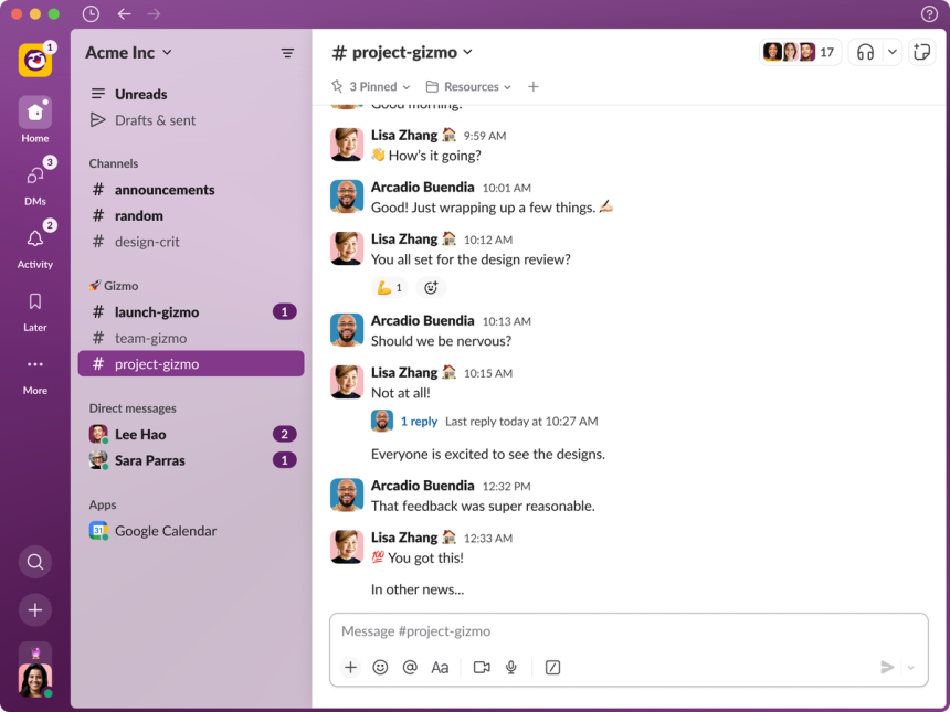
Popular workplace communication tool Slack this week announced a major revamp of its software. In a blog post, the Salesforce-owned company described the reimagined user interface as being “built for focus” by using what it calls “better organization and [a] more intuitive layout.” The new interface, which began rolling out on Thursday, will continue to propagate over the coming months, according to Slack.
“We know millions of people start and end their workday in Slack, so we took great care to ensure these improvements make it a more productive and pleasant home,” Noah Weiss, chief product officer at Slack, said in a statement. “The new experience helps teams stay better organized, focus on what’s important, and quickly access a growing set of tools in Slack.”
According to Slack’s post, the redesign has three high-level goals: make navigating channels and the like easier; helps users focus on the most important information; and help users find their most essential tools.
Of course, one of the crucial components of Slack’s new interface is accessibility. Almost exactly a year ago, I spoke with Slack’s senior engineering manager Sommer Panage about the company’s then-new software update aimed at making the app more accessible to disabled people. Panage, whose pedigree includes stints at Twitter and Apple working on accessibility, told me accessibility is key as the app “becomes this digital headquarters even more, [especially] now that more people are working remotely, we want to be really sure that it is more accessible across all platforms and more equitable across all platforms.”
As for this week’s announcement, both Panage and product manager Chris Xu told me in recent interviews that a big part of the redesign’s accessibility is a conscious reduction of cognitive load. The bigger picture story, however, lies in the fact accessibility was prioritized from the very beginning once company leadership decided on undertaking the project.
“The dedicated accessibility teams at the company sprung into action once we realized this [the redesign] was something we had to get absolutely, critically right from an accessibility point of view,” Xu said.
Xu continued to tell me it was “really critical to us that we make sure that we were nailing accessibility out of the gate,” adding the teams zeroed in pretty early on in the development process that a core group to which particular attention should be paid is those who are neurodivergent. The allusion to cognitive load is a direct reflection of said attention, insofar as the general busyness of the Slack user interface has always held to potential to overwhelm anyone, but especially those with certain cognitive processing conditions. All told, Xu said the redesign was a “massive” interdisciplinary project internally, touching teams that had previously never worked with the accessibility group.
“We took accessibility considerations very seriously throughout the [development] process and tried to bake it into the fundamental way we were working from a design perspective, ensuring that the product was as accessible as we could possibly make,” said Ethan Eismann, Slack’s senior vice president of design. “It was a non-negotiable point.”
Whether Slack’s efforts here are successful with customers from a usability standpoint will be determined in the months ahead. For now, the biggest lesson to learn from what Slack has pushed out the door goes beyond the project itself. It’s about the mindset and the culture around accessibility. It’s making accessibility part and parcel of design.
When I sat down with Panage last year, she explained to me Slack’s institutional eagerness to make Slack a better product by making it more accessible to disabled people. Upon her arrival, one of her goals was to help “bring together an accessibility team kind of under one engineering roof” as a means of bringing more cohesiveness to the company in this regard. The truth is, accessibility has long been a high priority at Slack; it was one of the main motivators for Panage to climb aboard the ship.
The redesign shows Slack’s commitment to the disability community.
“[The redesign] is a reflection of how much more mature Slack has gotten in its accessibility process. That this is something that leaders like Ethan are talking about regularly and are asking teams about in high-level reviews, that individual contributors of all different disciplines are getting engaged,” Xu said of Slack’s ethos around accessibility. “Everyone from designers and product folks and engineers all the way to the help team is going to work on documentation and making sure that everything we roll out has this [accessibility] considered in a holistic way. That’s really, to me, what’s exciting is that it reflects that not only we don’t just work on accessibility for ‘accessibility features.’ This is something that’s becoming part of our standard practice for even the most fundamental and large-scale projects, which this certainly is.”
Panage concurred. “I think, for me coming to Slack, one of the things I wanted to see was to build a deeper culture of accessibility—something where it’s not a checkbox. It’s not a thing that some people think about. It’s a thing that is part of everyone’s day-to-day [work]. It’s part of everyone’s language. it’s part of how we think about building a product,” she said of her goals for impacting Slack’s accessibility efforts. “I think I’m really starting to see that now, particularly with this project being so large-scale; more and more people from all over the company are thinking about this every day [and] talking about every day [and] reaching out to the accessibility team and asking us questions. That is a reflection of Slack starting to really integrate accessibility into the entire culture of the company, not it just being a little piece of the work.”
For his part, Eismann pointed to industry leaders such as Apple building best-of-breed accessibility software into its panoply of operating systems. Slack, he said, is the operating system for many companies at work in terms of communication and productivity. Slack is a cross-platform app, running on mobile and desktop in many incarnations, and Eismann said a big goal of the company is to “make sure that the operating system for your work is as accessible as it possibly can be.”
He continued: “We’re baking it [accessibility] into our process and the way that we fundamentally work. “I’ve been really pleased to see the evolution of the full spectrum set of design considerations that we account for when we’re working on projects from the beginning. When you make accessibility considerations and commitment to accessibility into your design process from the beginning, the outcome is better for everybody; we’ve seen this time and time again. You get a better product, a more usable product, [and] a more inclusive product. I’ve been pleased by our progress here, but this is an evergreen commitment. We can only do better as we move forward. It’s safe to say we have a fundamental goal that we want to be one of the best in industry when it comes to making our product as inclusive and accessible as possible.”
Read the full article here


